? ??????????????????? ????Easy Install Instructions:???1. Copy the Code??2. Log in to your Blogger account
and go to "Manage Layout" from the Blogger Dashboard??3. Click on the "Edit HTML" tab.??4. Delete the code already in the "Edit Template" box and paste the new code in.??5. Click "S BLOGGER TEMPLATES AND TWITTER BACKGROUNDS ?

Friday, October 16, 2009

Photoshop Effect


NMatrix EffectN
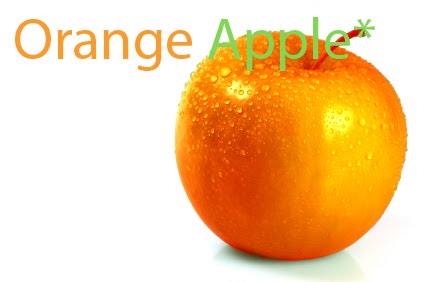
Step 1: Make a new 400px x 230px then press "D" on your keyboard, the background should be color white.(but for me I changed the size)

next go to texture-grain and make sure the settings for intensity and contrast 100% and vertical.

Now go to artistic-neon glow and make the glow size 5, then the glow brightness a 20, and make sure its green.
now your DONE! :)
Tuesday, October 13, 2009

Elements


Centre of Interest
  1. The first image goes into centre of interest because it stands out amoung the background.(pink tree+blue background)
  2. The CUTE goldfish is for centre of interest because it is somewhere you usually would not find a goldfish..well hopefully not where this goldfish is. o.o;
  3. The last image is a girl that looks like she underwater. It goes with this topic because black background makes this white image stand out, and she looks very bright and fluid so she catches your eyes.


Timing


  1. The first image of the bumblebee on the guys eye was timing because he was not blinking when the bee was right in the centre of his eye, and the bee is also very still as it is, and this image can also be centre of interest.


  2. This second image is obviously timing because the man is falling off of a ladder, and they make it look like they are slowing down the image.


  3. The last one is someone popping a bubble. This one is timing as well because they caught right on time popping the bubble.


Humour


  1. The first one is the sign, and that picture is very funny because they are talking about how people are not "aiming" properly when going to the bathroom.


2. The second image is funny because her body looks deformed and you cant even see her head, she looks like a cripple. :/


3.The last image is of the "christ died for our Dunkin Donuts". Obviously you can tell that its funny because Christ ACTUALLY didn't die for Dunkin Donuts.


Monday, October 5, 2009

Album


MAlbumsM

My first album was "City Of Rock".I had alot of fun with this one because many things match with it and the blue theme makes it POP out very well.At first it was very blah~ but now it looks alot more fun than it did, at first it was a weird brown background...kind of a downer. But then i was able to do some colour adjustments so that it could match the TTC stop that had bubbles on it. After adding text to finish it off im preety much done, and again i made the text match with that background. I made it very light my adding outer glow.

My second album cover was "Savage Garden".This one was also preety fun to play around with, but I had a hard time with picking the album cover because I didnt want something to plain, and I had a few to choose between. But after looking at album covers for a while I found one that looked preety good~ And again i didnt some colour adjustments to look more green and bring the colour and light out more. The text blends in well with the background, and I think that the band name works will with everything I have portrayed here.
Either way I had some fun with both of these albums :D